Who attended? Who's missing? How do you know?
As you plan your event are you building in a data collection process so that after the event you can create maps that help you understand who attended? As you view the information shown below, follow the blog articles. I'll be updating this page throughout 2026 and post new blog articles each week.
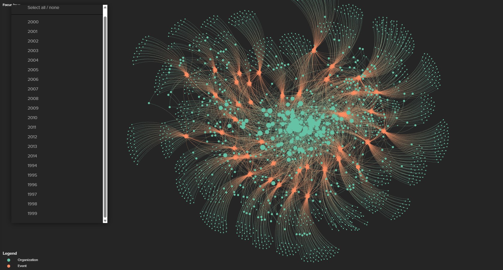
I hosted Tutor/Mentor Leadership and Networking Conferences in Chicago every six months from May 1994 to May 2015. This is a graphic shows an interactive visualization created by students in an Information Visualization (IVMOOC) class at Indiana University. It shows participants at each conference. See images created from this and a description of its purpose in this article.
I've used geographic maps since 1990s, and concept maps since 2005, to show how I and everyone else can help draw people to the information available in web libraries, or in face-to-face conferences, that focus on helping youth in high poverty areas move through school and into adult lives with jobs that enable them to raise their own kids free from poverty,
I do this almost every day, using social media, my blogs, my websites and email newsletter. In the 1990s I also had a printed newsletter and a PR firm helping generate media stories. Yet, the big questions always have been a) who is attending?; b) what networks are they part of? and c) what geography do they represent?.

I've used maps since 1993 to show where volunteer-based tutor/mentor programs are most needed, based on indicators such as high poverty, poorly performing schools, crime rates, health disparities, etc. Since 2010 I've attempted to use maps to show participation in the Tutor/Mentor Leadership and Networking Conferences that I hosted in Chicago. The map shown above is from the November 2008 conference. See it and other maps on this page.
As you plan an event, think of the timeline you'll need. Think of how you might use registration data in more ways.
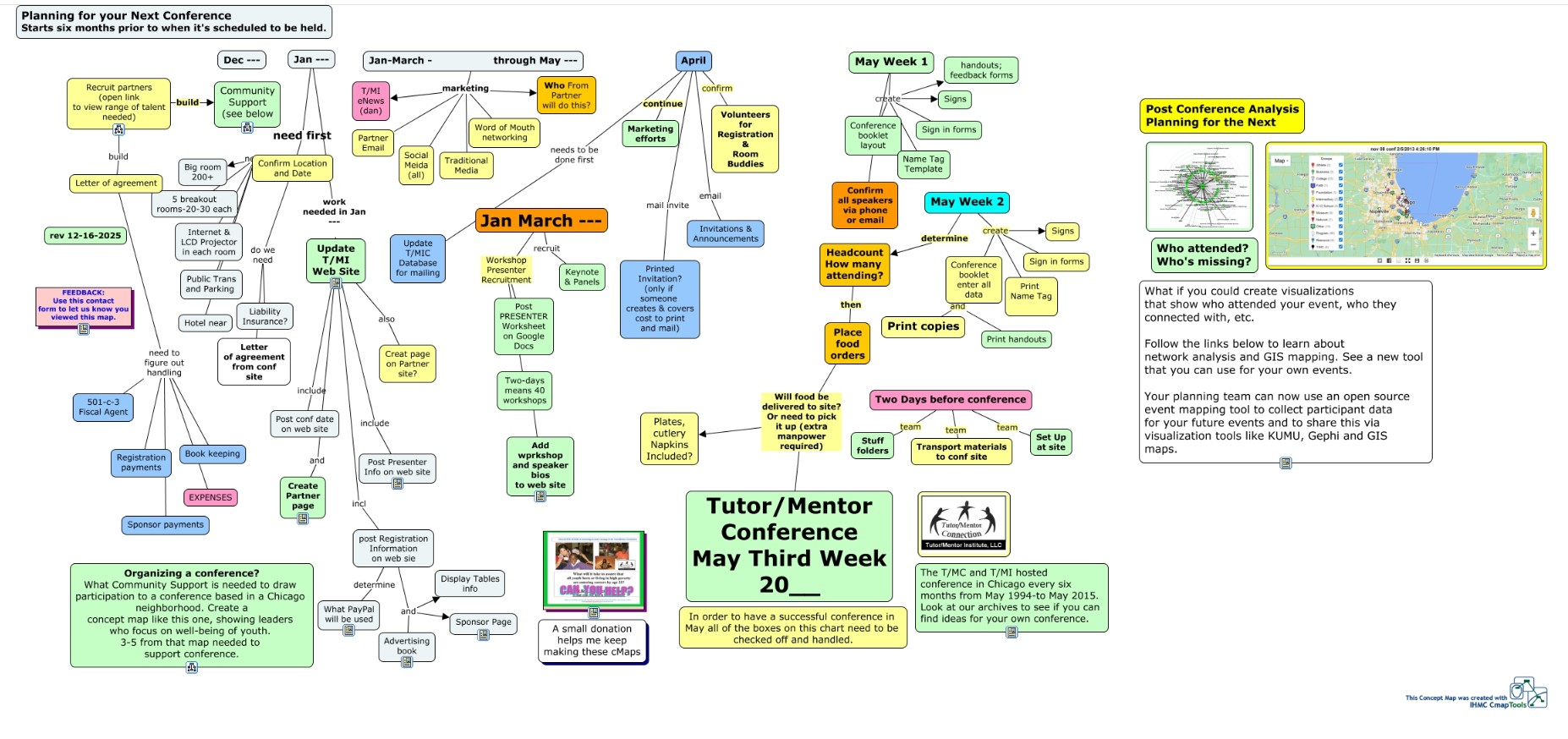
This concept map shows the timeline I followed to organize Tutor/Mentor Leadership and Networking Conference in Chicago every six months from May 1994 to May 2015. If you organize events, do you have a timeline like this? At the far right I've added the questions "Who attended? Who's Missing?" which is an analysis every event organizer should be doing if the event is part of an on-going effort to solve any specific problem. In my cases, the conferences were part of an on-going, year-round strateg intended to help volunteer-based tutor/mentor programs grow in all high poverty areas of the Chicago region.
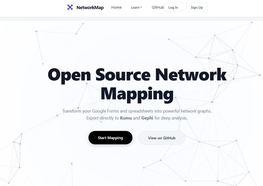
Now there is a new open source resource that you can use to collect and analyze data from the events you host.
In December 2025 a team of students from the Information Visualization (IVMOOC) class at Indiana University shared the project they had been working on for me since September 2025. I'm very impressed with the work they did. The interactive visualization at the top of this page was created by the team to demonstrate how you can convert conference registration data into interactive visualizations using Kumu.io, Gephi or Tablueau. You can see it in this article. In the article I show several other views that I created from the interactive Kumu project.
However, this was only a demonstration of what's possible. To understand the value of this project, I urge you to read the IVMOOC team final report (click here).
Then take time to study the "Open Source Network Mapping" app created by the team. (click here). And, view this comprehensive "How to" guide (click here).
All of this information is FREELY available on GitHub.

You can find the link to the GitHup page in the menu bar at the top of the Network Mapping app. You can go directly to it at this page. The IVMOOC students did a comprehensive job of describing the benefits of using these tools, as well as the features available and step-by-step instructions for using them. If you connect with Dan Bassill on LinkedIn, and follow his posts, you'll soon be able to connect directly to IVMOOC team members and to others in the larger network analysis community who Dan has learned from over the past 18 years.
Spend time reading some of the blog articles I've posted about network analysis and mapping participation.
This concept map can be a study guide to deepen your understanding of the use and value of mapping visualization and strategies. Recruit a team of students/volunteers and lead them through this information. As they create and share their own maps they will contribute to a wider acceptance and understanding, and hopefully, better outcomes for those working to solve complex problems.
Create and Share Your Own Visualizations
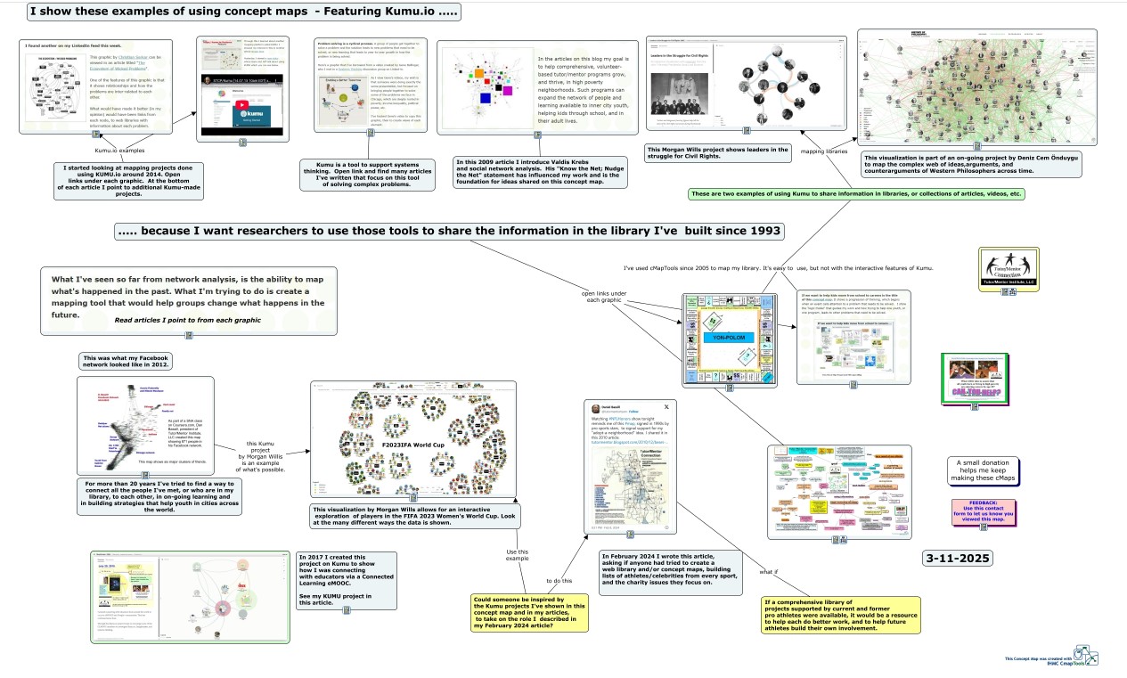
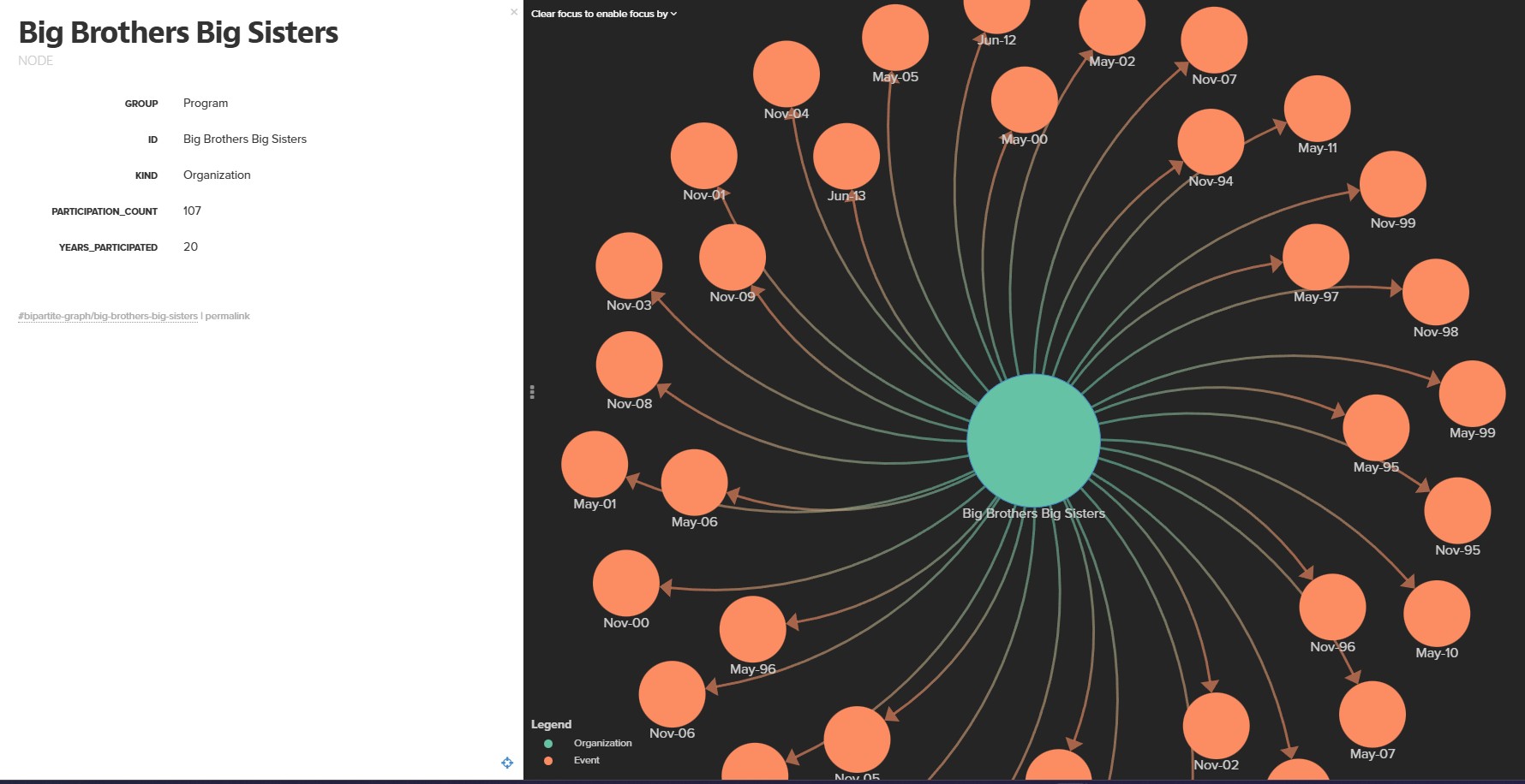
If your organization attended one of the past Leadership Conferences you can find it on the interactive Kumu map, then create an image showing all the conferences you were part of. This one shows Big Brothers Big Sisters of Metropolitan Chicago, who participated in many of the conferences.
eMail Dan at
Social Media Connections
Do a web search for "tutor mentor" and you'll find Dan on many platforms.
BlueSky - https://bsky.app/profile/tutormentor.bsky.social
Dan Bassill on LinkedIn
Tutor/Mentor Institute, LLCon Facebook group
Dan Bassill on Facebook Page
Dan Bassill on Mastodon - https://mastodon.social/@tutormentor1,
https://mastodon.garden/@tutormentor1 and @
Dan Bassill on Instagram and on Twitter (X)
Dan Bassill on Medium - https://medium.com/@danielfbassill
Dan Bassill on Substack.com - https://substack.com/@danielbassill319958?